Brief: Plug in a new service stream for the pre-pay customers of British Gas to enable (without redesigning the existing post-pay app).
Topping up one’s prepay account without visiting a store.
Easy top-up and balance visibility
All help and other common functionality of the existing postpaid app will need to be included in this section.
Existing mobile post-pay app
WHY? What? When?
Answers
The app was designed and launched 6 years back
Functionalities kept getting on as tiles since then
Designed for both iOS and Android
Primary user needs
(based on user research and business needs)
- Top up my meter
- View time-stamped balance
- Last top-up amount
- Manage payment cards
Add, edit, and remove cards
- Contact customer services
- Book an engineer
- In an emergency
Secondary user needs
- Payment history
- Not have to carry a card all the time for kiosk top up
- HIVE
- Manage user details
- Help and advice
Findings
At a glance view of balance
Visualisation of amounts used or percentage used
seamless top-up process
Call to action at a glance information to quicken the top process
Compartmentalisation of information, secondary information tucked away in burger menus
Mobile finger gestures used for use navigation purposes
Workshops
Product owner
Findings
Business goals
Functions the business envisages as primary and secondary
Insight into user research
Tutorials for app learning
The problem around the actual top-up time lag
----------------------------------------------------------------------
Developer
Findings
Functional specifications
Understanding of development limitations for both
iOS and android
iOS and android
Limitations around the existing tile dashboard for the
new pre-pay app feature
new pre-pay app feature
----------------------------------------------------------------------
Researcher
Findings
Gaining an understanding of different kinds of users
Needs of users' primary and secondary
User usage discovery - user would like to avoid
going into emergency credit etc
going into emergency credit etc
User persona discovery


Usability review
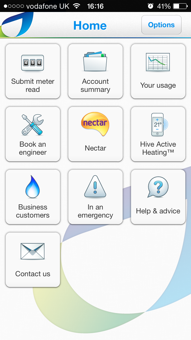
The present mobile app has a few user experience issues
The tile dashboard display is not very user-friendly and can be a bit misleading to the user as it gives an impression of a dashboard one might find after they log into their account.
When the user tries to use the tile feature he is prompted to log in when the process should be the other way around.
On the dashboard due to the bright colour of the nectar logo that tile is most prominent.
All the other icons seem to have the same prominence due to their colour and visual emphasis, therefore, it might be difficult to prioritise the more important features. The user will not be able to find what they're looking for at a glance.
On this dashboard screen, it is very difficult to decipher which information is accessible to the user with or without a login as they all look the same.
The brand is not well represented on this screen
It lacks personalisation and key brand message attributes.
Branding from a user experience perspective is not just about putting a logo on a screen but it's about the impression a customer leaves with after interacting with the brand's product. It's also about the user's experience on this landing screen.
Questions around brand identifications relating to the existing app
Asking the following questions that are essential:
Did they easily find the information they were looking for?
Did they find the page too busy or did it lack warmth and was not welcoming?
Could they relate it to the British Gas brand in terms of the look and feel they have seen on other British Gas communications such as advertisements, website, direct mail, vans, newsletters etc?
Can they identify this screen with the impression they have of the BG brand?
Also during the design process, these questions need answering